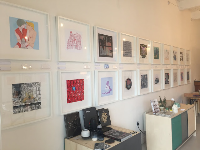
The exhibition was only really on three walls, but each piece was framed in identical white, square frames, with the name of the illustrator and and the piece underneath them. This was quite different to what you'd see in perhaps a fine art gallery or modern art, where theres no consistency to any of it, and things are just displayed as-is. I think for someone like myself who lives for organisation and is really thrown off when theres not a clear system to what I'm looking at, exhibitions like this one really please me. You start off knowing who these pieces are all by and why they're here, what they were made in response to etc and that makes the experience all the more pleasurable because you can take all those things into account when appreciating the great art that you're seeing rather that having to spend most of your time decoding what each individual piece means and why it is where it is.
The other thing that I think made this exhibition quite so special for me was because I guess we are kind of bias, being illustration students. We already had the privilege of knowing that these were all student illustrations, and we are illustrators, so the way the images were composed, and the media were all massively interesting to us because that what we do as well. I think if the exhibition had been structured in the same format but maybe been showing photography or something I would have been able to follow it and appreciate the images, but as this was something that really interests me and is a part of my life too I had the privilege of being able to be absorbed in the making and the process and the composition of the pictures. I could also look at them and see what could relate between their practise and mine, for instance I think the main difference between my current work and their more developed work is their knowledge and experience in putting together an image in the most effective way, in terms of composition and selecting the appropriate media and colours. I know mostly this is something that I will learn in time but it was nice to look at the wide variety of ways it possible to construct a picture and still have it be successful.
All in all I think this was a very positive gallery experience, I found it very pleasing to be able to focus on everything for such extended periods of time and it was inspiring to be around such brilliant art. In future, although I know its important to consume all different types of art and images, and I will continue to go to other exhibitions of things like fine art and photography, I will make an effort to seek out more illustration specific exhibitions like this one. I think they could really help me if I'm feeling a bit mentally blocked.


 |
| I WANT TO MAKE ART THIS GOOD |
No comments:
Post a Comment